↓
Make the games a game changer.
From logo to typo, from social to environnemental, the Ecobranding and Royalties agencies have designed an emblem symbolic of change.
Driven
By French Liberty
The first feminine face of the Games.
The Parisienne, a universal legend, embodied by iconic women. A human face of games for the people and with the people.
“It’s the symbol of women’s emancipation, and even today we still need to fight. So yes, I love this logo for that.”
Bringing values together.
The feminine face of a Parisienne, an allegory of emancipation and freedom embodied by many figures, including Marianne.
The Olympic flame and the Promethean myth of progress for all.
The gold medal as a reward of talent and of surpassing oneself.

Revolutionizing
the image of sport
“Paris 2024,
live up to your logo!”
Ligue du Droit International des Femmes
(Founded by Simone De Beauvoir)
Men and women under the same sports allegory.
Sport is evolving, as is the number of women participating in it. However, the image of sport has not really changed. Our emblem is an update image which matches the reality of sport today.
→ How sport is figured in advertising
Female participation
in the Olympic Games.

One year after our logo reveal, Paris 2024 announced a total parity between male and female athletes.
A historic first!
In the mood
for low carbon
Ecobranding the Olympic Games.
Apply the Ecobranding method to the brand’s identity materials, and adapt the identity according of the media: light mode on paper to limit ink consumption, and dark mode on screen to limit power consumption.

Low ink consumption logo

Same Paralympic & Olympic emblem
Geometrically pure

Design with minimum data

Eco dark mode version
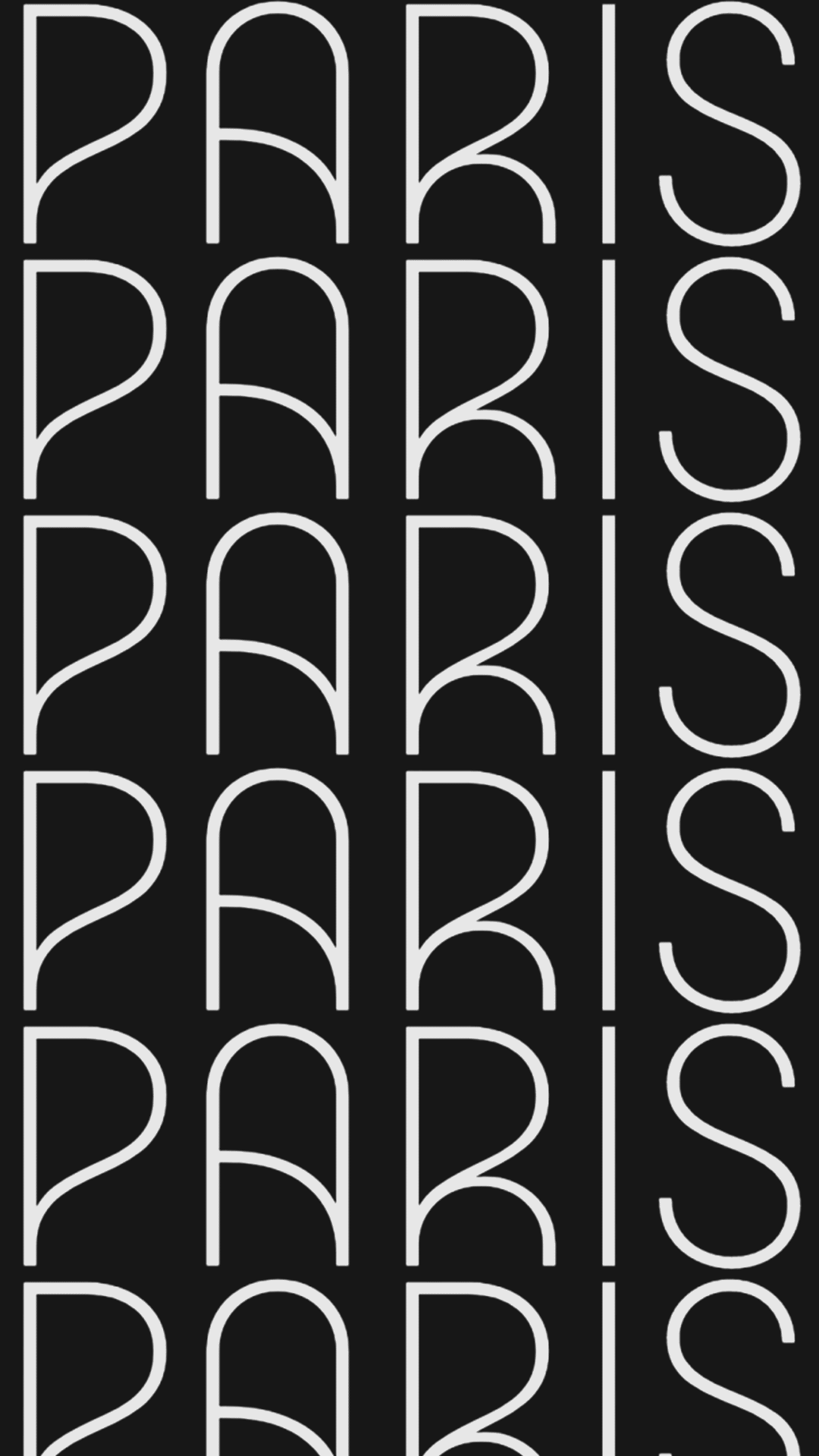
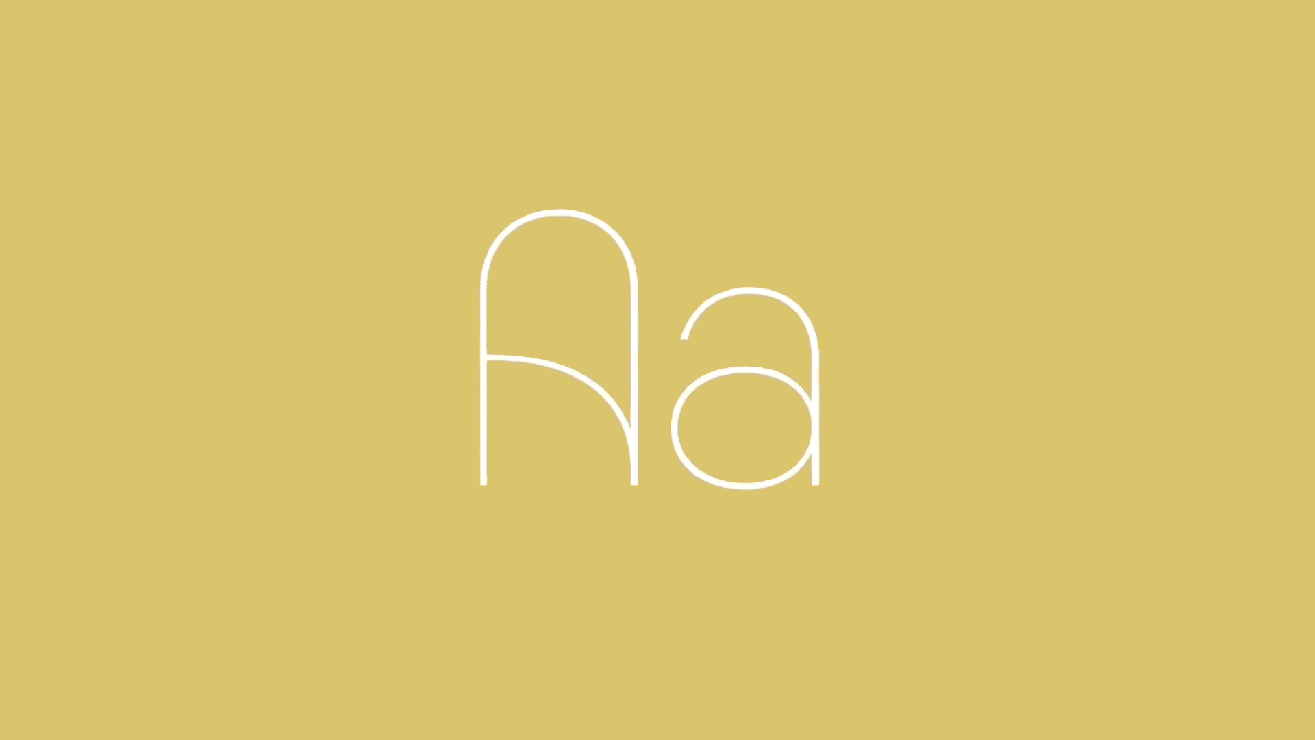
From Art Deco
to Art d’Eco
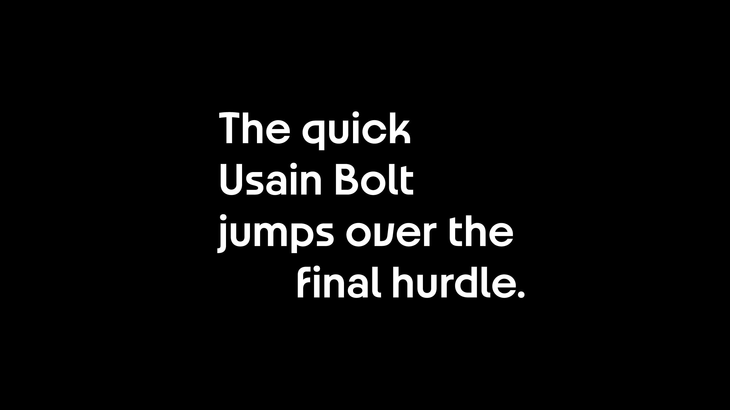
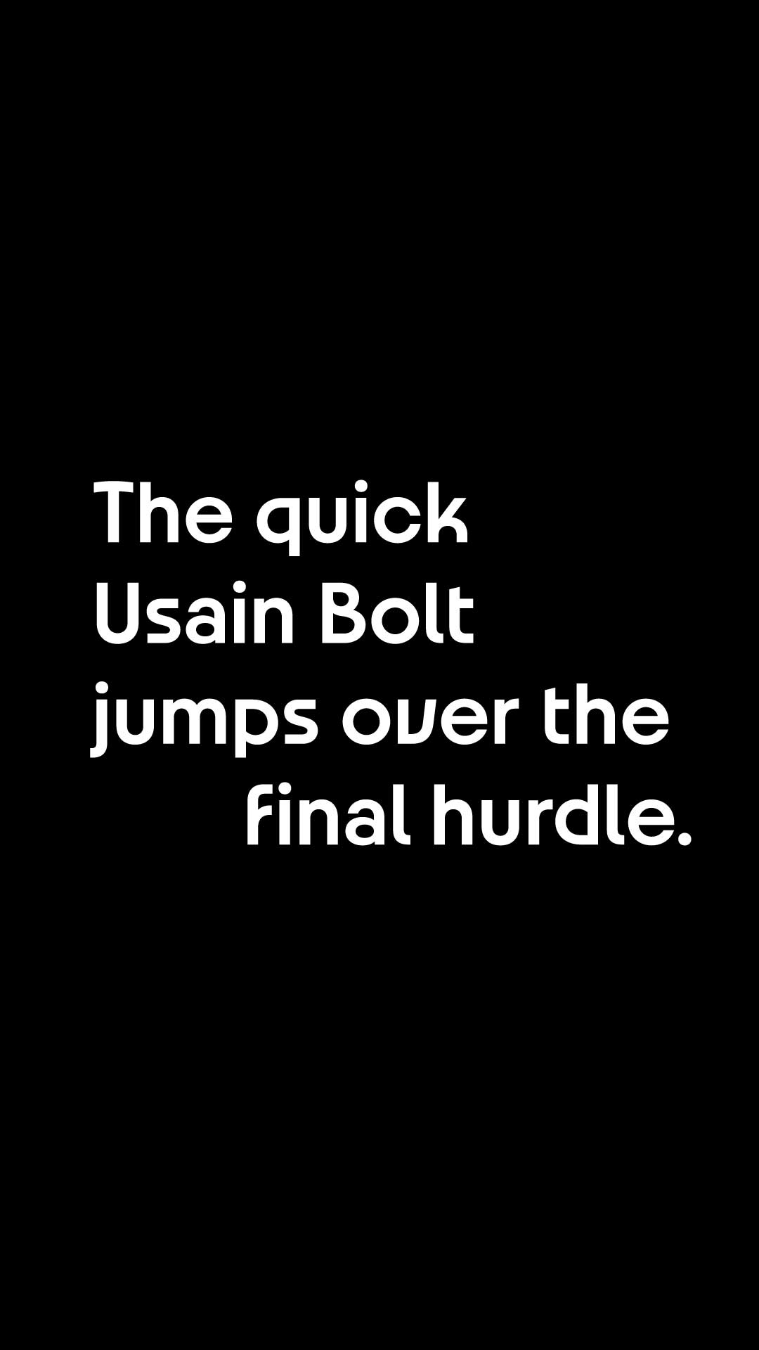
A face with an eco-typeface.
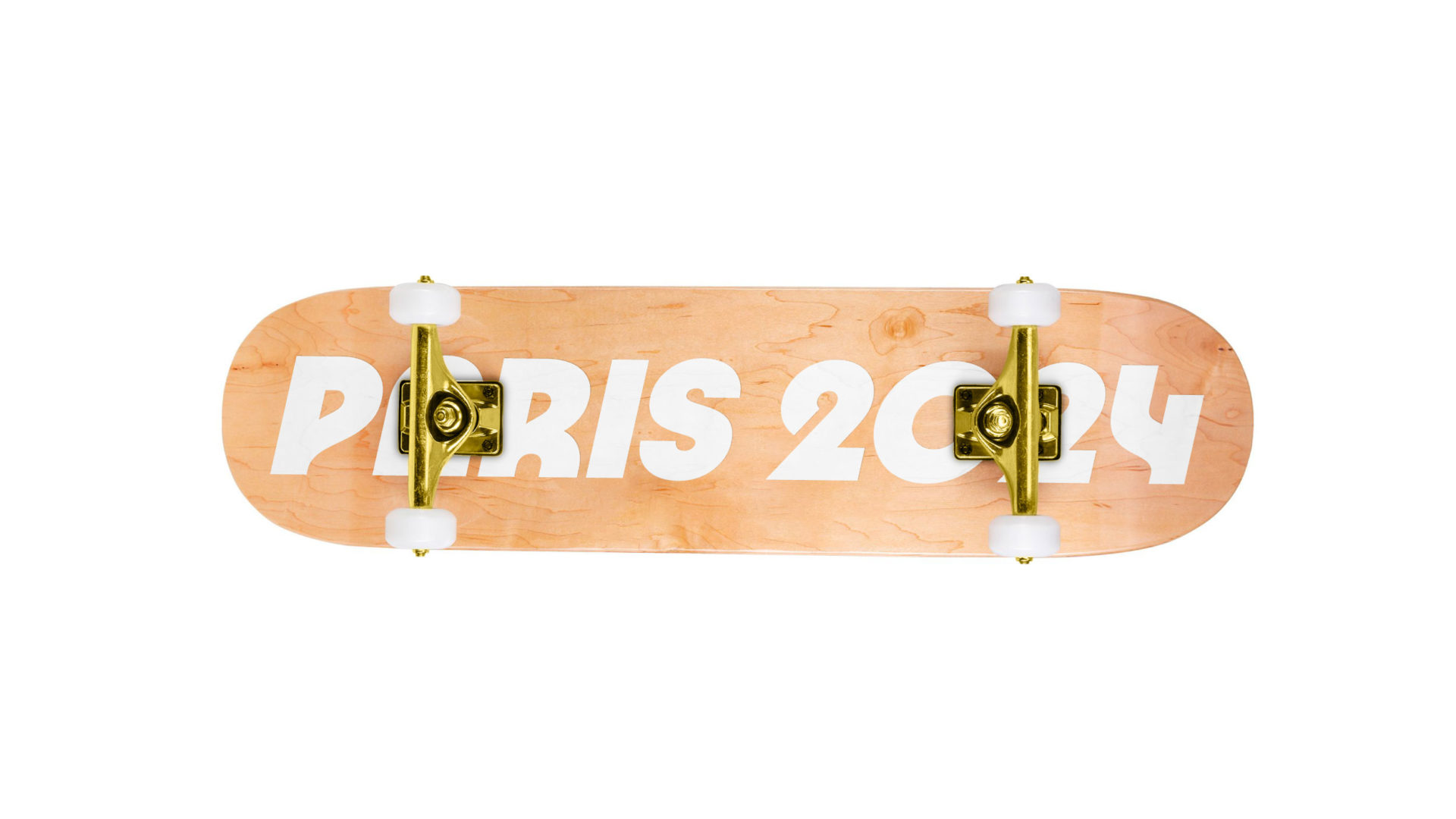
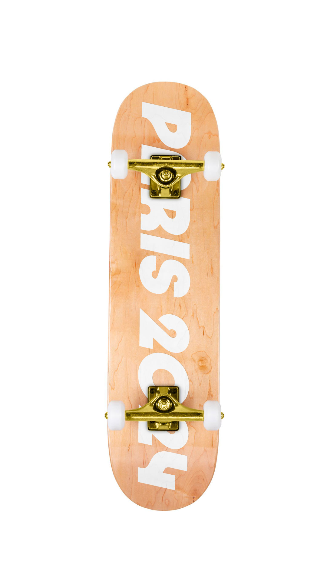
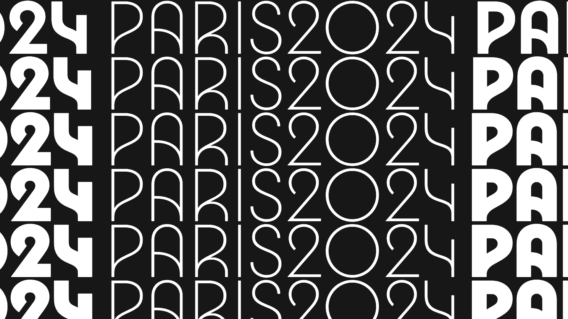
Inspired by Art Deco’s radically geometric yet eccentric spirit, the Paris 2024 typeface has been eco-designed to limit the use of paper needed for materials and limits the power consumption on digital media.

A typeface designed to reduce paper and ink consumption thanks to the tightly drawn letters. The variable font size also reduces power consumption thanks to its single font file.
Paper: -6% of system fonts
Ink: -17,23% of system fonts
Data: -82% of standards files

Eco-colors
Soft & Natural
From colors to dark.
Colors with limited inking rates to reduce ink consumption.
A Dark Mode color system on displays to reduce power consumption.

Print: Colors that do not exceed a 100% inking rate.
Screen: Dark mode saves the battery life of smartphones with OLED displays.
This Face
is yours
“This face is yours, it’s the face of the men and women who are mobilized, of the athletes who have come from the four corners of the world to surpass themselves, of the Olympic values.”
A face that comes to life with you.
An emblem that adapts to your emotions, that reacts, and can even talk to you. It’s up to us to bring our emblem to life.
A face with
many faces
Everyone can create their own story with this emblem.
It is free of all interpretations, a face, a flame, a woman, Marianne, or something else.
Everyone can interpret it in their own way, and this is probably the most human aspect of this emblem.
“We are very impressed…
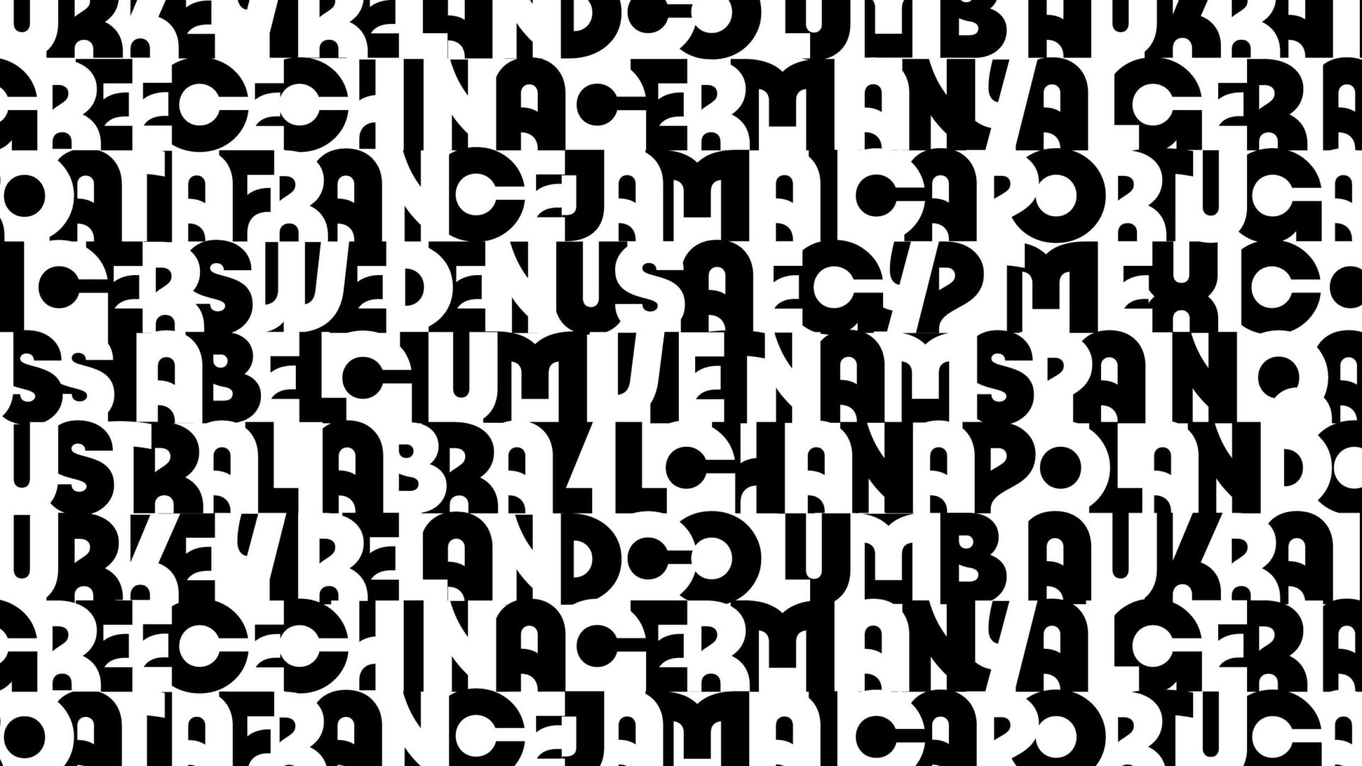
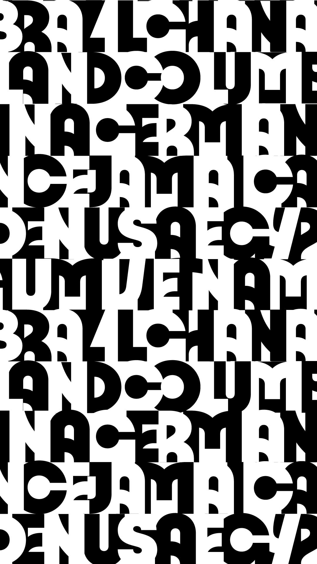
The emblem of Paris 2024 has had a colossal international impact”